The contact page is likely to get more page views than any other page. It’s true for all digital marketers.
I feel that marketers should dedicate more time to creating a user-friendly and fantastic contact page as it’s the beginning of your relationship with your target audience.
Not only this, but contact forms are also important for your business websites as they have a massive impact on your conversions.
Undoubtedly, this page is one of the most viewed pages on your website to drive more conversions. Any contact page mistakes can cost you to lose conversions without you realizing it.
Many people have asked me this question: What do you think are the 8 most common mistakes on a web contact page?
I gave it in-depth thought and curated a list of common mistakes that can make or break your user experience.
8 Contact Page Mistakes to Avoid!
Mistake #1: No contact page at all
Your contact page is like a bridge between your business and potential customers. Mostly all websites are built to interact with visitors, asking them to buy your products or services, and providing necessary information.
Every visitor will have an extra question or business opportunity for you. Thus, it’s essential to make yourself clear about how to reach you. This is the biggest mistake that should be avoided, in my opinion.
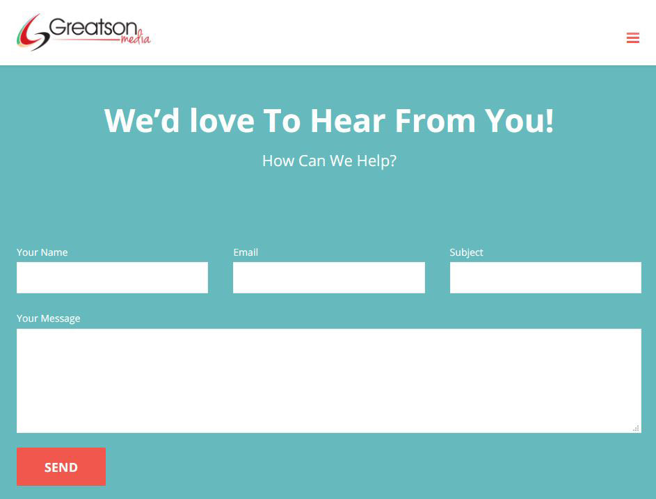
Mistake #2: Inadequate contact forms
Your contact form should be based on the purpose and needs of your potential customers.
Instead of a standard contact form that consists of a name, address, and message, it’s better to prepare a specific contact form that allows your users to craft a tailored response rather than a generic one.
Your form should address their issues and should not take more than 2 minutes to fill out. Your questions should also be adequate for them to understand your needs without being too intrusive.
Mistake #3: Unclear and flashy names for your contact page
Finding a fancy contact name can be annoying during an internal search. Finding your contact page should be as easy as pie.
There are 2 options to choose from:
- Add a menu item ‘Contact’ to your main or footer menu (you can do that for both!).
- Add your contact page at example.com/contact/.
It’s simple to search and link to your contact page. Your title should be ‘Contact,’ ‘Contact Us,’ ‘Get in Touch,’ etc. Never use fancy variations like ‘Let’s talk business’ that doesn’t cover your page’s immediate goal.
Pro Tip: Make things simple and clear.
Mistake #4: Giving no options to contact you privately
Simply writing ‘Reach out to us on Twitter’ or ‘Drop a comment below’ doesn’t serve the purpose. Make sure to display the links to your social profiles on your contact page. This is the best way to connect to your audience and stay consistent in answering their questions.
I think displaying your social profiles would make sense only if you monitor your social media platforms daily. Make sure you are active on all given social media profiles.
Mistake #5: Failing to analyze submissions
If you fail to analyze the type of submissions you receive on your contact page, it will affect your contact page design, form, and detailed information.
It gives you a good idea about why people are contacting you. This gives you sufficient time to make necessary changes and address the issues.
Regular analysis has helped me bring awareness to all site-related problems, depending on the number of submissions received and their frequency.
Being responsive gives the sender the confidence that their injury will be received by the right person and answered adequately.
Mistake #6: Not amending your broken forms
You can’t afford to have broken forms on your site. They can be broken in various ways and often for weird reasons.
I make sure to test my contact form once a month, particularly when I haven’t received any submissions lately. This has helped me to address the issue before it gets worse.
Mistake #7: Mandatory use of CAPTCHA
You all might be aware that CAPTCHAs aren’t disability-friendly – which means you’ve enough reason to scrap them. They can kill your conversion rate and user experience.
According to a study carried out by Stanford University into the use of CAPTCHA by humans, only 71% of the time will three users agree on the CAPTCHA image content.
It isn’t worth it when users need to refresh the code to find an image they may not like.
Luckily, there are viable alternatives to CAPTCHA that are not a problem for disabled and non-English speaking people. Whenever I visit a site, I want to get in and out in just 5 minutes. Avoid adding CAPTCHA to save your customer’s time.
Mistake #8: The feeling that your contact page looks ‘perfect’
Now that you’ve corrected all the above mistakes you might feel like you can be at ease, but truthfully, you need to stay on your toes to maintain the perfect contact page.
You’re likely to face other difficulties when it comes to your contact conversions. Make sure you pay attention to other issues like A/B testing, language use with contact buttons, and decreasing form usage.
By Grace P.