 “Where scanning was once more horizontal, the adoption of mobile devices over the past 9 years has habitually conditioned searchers to now scan more vertically—they are looking for the fastest path to the desired content, and, compared to 9 years ago, they are viewing more search results listings during a single session and spending less time viewing each one.” – Rebecca Maynes
There’s a fascinating look at eye-tracking research on the Moz Blog. Rebecca Maynes of Mediative lets us see the results of their 2014 study on how users view and interact with today’s Google SERPs. A similar study done in 2005 showed the “Golden Triangle” pattern, where readers started at the top left and read across the page, gradually reading less and less as they got lower. But now that triangle is not evident in the way SERPs are looked at. The preponderance of mobile phones has changed the way we look at search results.
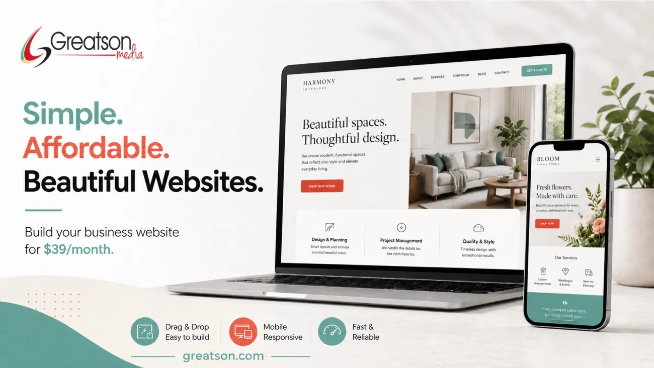
What Does Your Site Look Like On A Phone?
I think it’s always a good idea to do some reality checks every once in a while, and one reality check is getting a few different friends to show you what your marketing efforts and website pages look like on their phones. No matter what it looks like on the bigger screen of a laptop, it has to translate well into the different mobile devices your customers use to find your business. Responsive website development and design is just not an “extra” any more because mobile usage has become so commonplace it changed the way we look at things.
Photo Credit: Mobile Search/shutterstock
[search]