How to Use Twitter’s New Header and Discover Tab Features
 You need to maintain an exciting online presence to keep up with those Jones, right? The old adage is no different when it comes to the hottest social networks – only the competition’s a whole heck of a lot more fierce.
That explains why you see so many new features pop up on Google+, Facebook, Twitter, and other big shot social networks on a seemingly near-weekly basis. In fact, just a few days ago, Twitter overhauled its platform yet again with some awesome new features designed to keep things edgy for users. Good news, Twitter lovers – they rock. The big winners are the new header image options for individual and business accounts and the dynamic changes to the new Discover tab.
Changing Your Twitter Account’s Header Image
Twitter lifted a page right out of Facebook’s playbook, and it’s a cool new way to give your Twitter profile page a major facelift. True, the new header images you can add to your page have shades of Google+ and Facebook timeline. However, I nevertheless think this is a fantastic new addition if you’re into the whole online “branding” thing (by the way, if you’re not… you should be). Creating and maintaining a unified online presence is the single best way to create a network of peers in your niche and build your brand.
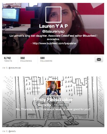
It’s easy to insert a new header image, and people are already hacking away at their Twitter accounts to create fun new designs to spice up their profiles. Just check out these cool pages created by some staffers over at Buzzfeed.com:
Image 1:

Source: Buzzfeed.com
The cool thing about designing your new page is that you can do it via mobile app or directly through the Twitter website. When you do it through the website, you should first head over to your account’s Design page. Once you’ve navigated there, simply scroll down until you see the section labeled “Customize your own.” Then, look for the button labeled “Change header.” From there, you can upload your own unique header image directly to your profile.
You are free to shift and scale your header image to your heart’s desire. Keep in mind, though, that the original size of the image cannot be greater than 1252×626 pixels, and the maximum size of your file must be no greater than 5 megabytes. Although Twitter doesn’t offer specifics about size minimums, most design sites are reporting that any image with a width smaller than 640 pixels will look pretty rough – so make sure to size things up before you upload.
Once you get your header image uploaded and placed in the perfect spot, you’ll see it displayed behind your avatar. As you can see from the examples above, you can go crazy with the creativity of your design – you can even get a bit silly with it. Try out lots of different ideas and styles, and check out other profiles on Twitter for inspiration before you get started.
Rediscovering the New Discover Tab
Those of you who are moderate to heavy Twitter users out there (you know who you are) will likely remember the introduction of the Discover tab. When it rolled out back in May, it essentially “socialized” the platform more efficiently by allowing users to view tweets and stories from their connections in one centralized area.
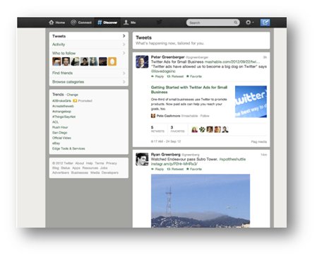
Then, in an official blog post published on September 28, Twitter announced it had reworked the Discover tab yet again. According to the post, “[W]hen you visit the Discover tab on Twitter.com, you’ll see a continuous stream of tweets, which automatically expand to show you the most relevant stories and most engaging photos.”
It’s supposedly, “What’s happening now, tailored for you.” Cool concept. If the platform can figure out what my real interests are and match them up with tweets that are actually relevant, I could see it being quite a tool. As it stands, here’s a look at the new features you can find under the tab from a Twitter blog example:
Image 2:

Photo credit: Twitter.com
Upon hearing about the new updates, I decided to take the features for a spin using my own account. The announcement had promised a new emphasis on rich media such as pictures, Twitter Cards, and articles. The first thing I noticed when I navigated to the Discover tab of my account was that the tweets on the page were indeed relevant to my interests (broadly). I also noticed that they were all expanded so that I could scroll through the page effortlessly and read the content with ease.
Twitter’s primary objective with this newest push is to inject rich media further into its platform. It was once a microblogging website with nothing but 140-character posts to offer users. With the cutthroat competition between social networks, Twitter knows it must continuously up the ante by improving the user experience at all costs. That’s likely the reason for the slew of new Discover tab features – as well as the motive for incorporating YouTube and Instagram content directly into users’ feeds.
The best part about the rivalry pitting the biggest social networks against one another is undoubtedly the never-ending flow of new features coming from each camp. Twitter’s new offerings do not disappoint, and I’m sure the trend of usable, visually stimulating upgrades will continue long into the future.


